Corvina CareOngoing
Benefits members can tell apartinstead of a list of providers
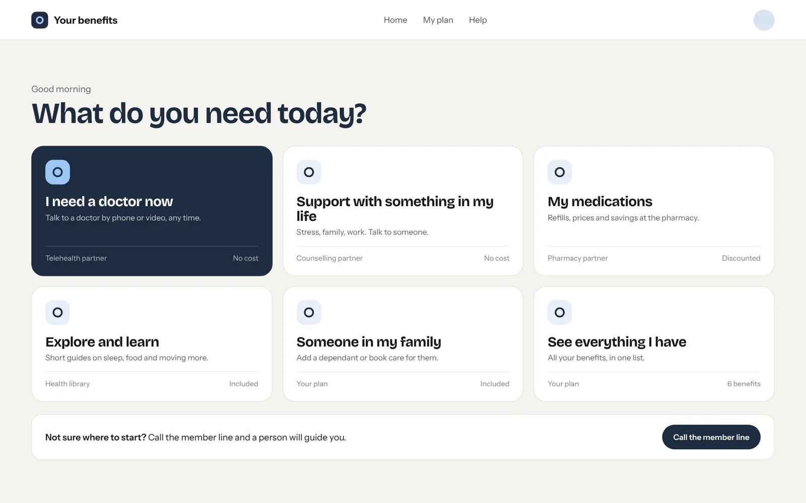
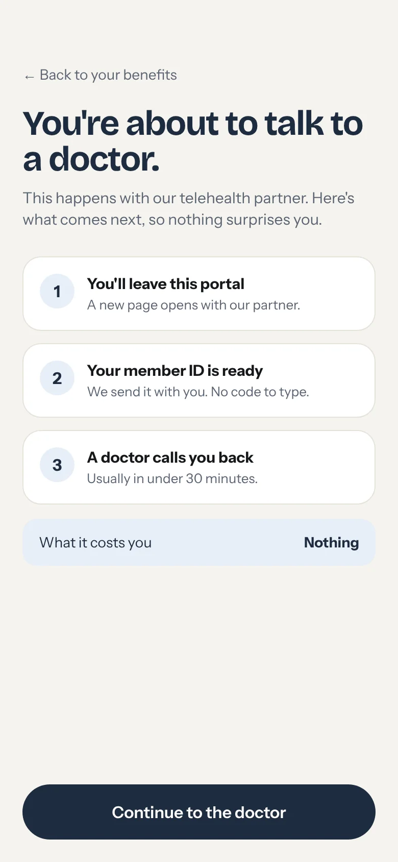
UX strategy and redesign for an employer-paid wellness portal in the US: audit, support research, information architecture and service design.
Corvina CareUX strategy and redesignOngoing
The challenge
Where it started
An employer-paid wellness portal bundles telehealth, counselling, prescriptions and health content, each from a different provider. Members had access to all of it. Very few used it. Corvina Care is not the real name: client and providers stay confidential.
The turn
- The brief
- A list of providers
- What was in the way
- “I need a doctor now”
Insight
The portal was organised the way the company buys services: by provider.
Members arrive with a situation. The support team's calls confirmed it: people asked which service to use, codes failed when they called without the portal, and two telehealth entries looked the same.
Before and after
Before: by provider
- Telehealth
- Counselling
- Prescriptions
- Health content
How the company buys services
After: by situation
- Need care now
- Something in your life
- Your medications
- Explore and learn
- Not sure? Talk to someone
- Know what comes next
How members arrive
What was done
Scope
Heuristic audit · Support research · Information architecture · Service design
What support heard most
- “Which service do I use?”
- “My code failed when I called.”
- “Two telehealth entries look the same.”
01
Audit and listen
A heuristic review of the whole portal plus the support team's call patterns, which surfaced friction no dashboard showed.
Good morning
1 · Need care now
2 · Support with something in your life
3 · Your medications
4 · Explore and learn
Fixed order. Personalised content, never personalised structure.
02
Re-cut the home around situations
Need care now. Support with something in your life. Your medications. Explore and learn. Six situation tiles instead of a list of programs, and a direct line for anyone who doesn't want to choose.
Not set up
Set up
Learn more, opened in place
Same three lines on every card: what you can do, who provides it, what it costs.
03
Make every step predictable
Each card says what you can do in the member's words, who provides it in small type, and what it costs in one line. A handoff screen explains what comes next before anyone leaves the portal.
The flows
Every step says what comes next
Result
Ongoing
In progress: research is done and the first design phase is underway. Results will be added when it ships.
What this case teaches
Ordering by how often something is used is anticipation, not a value judgement. Personalise the content, never the structure.
Facing a question like this one?
Let's talk